
San Diego FC Meets AI
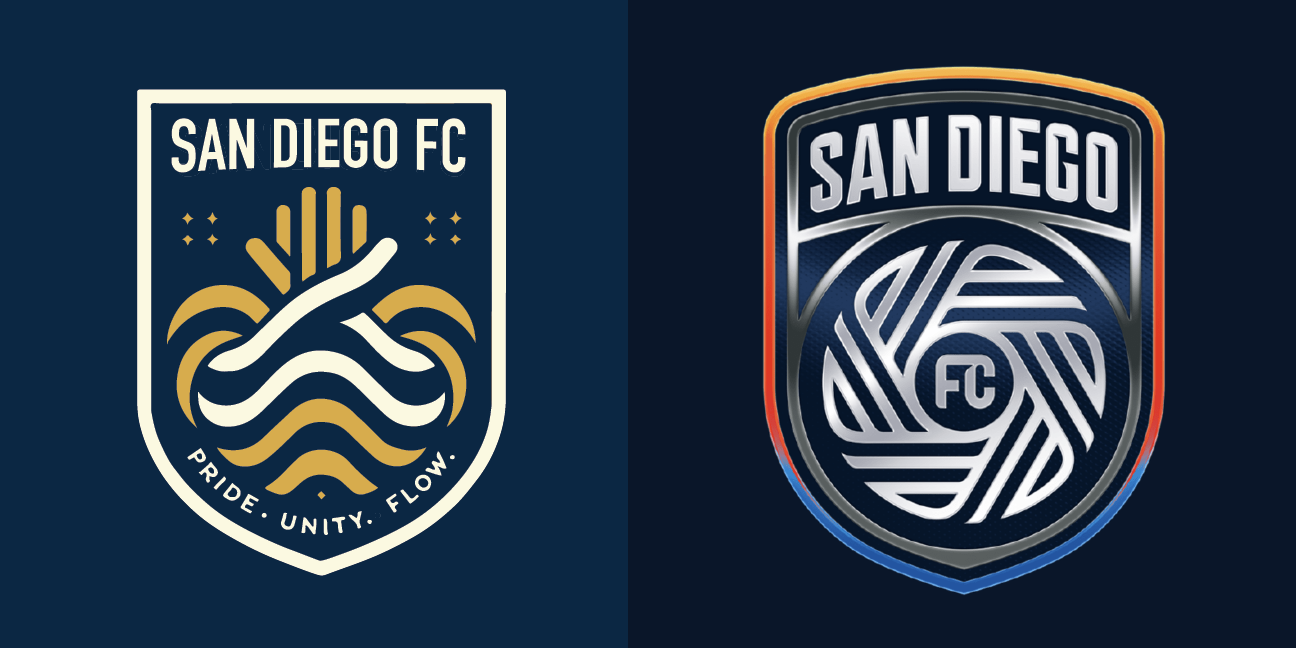
Sand Diego FC’s newly released crest alongside an AI created alternative.
As the leaves change color, marking the onset of Fall, another annual tradition unfolds. Major League Soccer (MLS) has introduced a new expansion team, complete with a fresh identity and crest. This year, the spotlight is on San Diego FC who will take to the pitch in 2025.
San Diego, set to play in the sparkling Snapdragon Stadium—the current home of NWSL's San Diego Wave—has unveiled a crest that aims to encapsulate the essence of the city. Like many MLS teams, San Diego emphasized the extensive community input that went into the creation of this new identity. The statistics are impressive: over 60 focus group participants, seven in-depth consultations with local sports professionals, more than 50,000 online survey responses, 150 hours of community engagement, 100 hours of individual interviews, and feedback from over 18 communities.

The key components of San Diego FC’s design.
From this comprehensive study, the core values of San Diego FC emerged: gratitude, diversity, humility (captured in the phrase "proud but not loud"), and flow—referring to a state of high performance and rhythm in life. The team also sought to incorporate key elements of the city into their branding. The chosen colors, Chrome and Azul, reflect the area's diversity and the oceanic landscape, respectively.
The silver crest, adorned with "San Diego" arched at the top over a sharp-edged soccer ball within a classic crest shape is surrounded by a thin gradient outline that shifts from blue to orange. This design, despite its extensive community input, has faced criticism, including from fans of the popular San Diego Loyal whose team will be shuttered to make room for the new MLS franchise. Described by some as resembling a car hood ornament or an Apple activity badge, it appears that the club may have missed the mark.

Reactions to San Diego FC’s crest taken from Threads.
Given the poor reception, we couldn't help but wonder if we could do better. To help us in an unofficial redesign, we turned to the most popular generator of content currently available, artificial intelligence. Specifically we asked the OpenAI’s DALL-E 3 the following:
if a designer were to create a new crest for a soccer team representing San Diego that symbolized the city as well as the ideas of pride, community and flow what would it look like? The designer would have to take into account that the crest is for a new team in Major League Soccer and the team describes itself as a football club. The designer would also be influenced by successful MLS designs like those of LAFC, Atlanta United and Austin FC.
chatGPT-4, the platform that we were using to access DALL-E 3, took in this request and provided the following design brief:
Given the specific requirements and inspirations mentioned, here's a detailed description of what the crest for the new San Diego football club might look like:
San Diego Football Club Crest Description:
Shape and Base:
The crest adopts a shield shape, reminiscent of traditional European football badges but with a modern twist to reflect the contemporary nature of MLS. This shape represents strength, unity, and defense.
Colors:
The primary colors are navy blue and gold, representing the Pacific Ocean and the sun-soaked beaches of San Diego. These colors also convey pride and prestige.
Secondary colors include white and a hint of green, symbolizing purity, hope, and the city's lush parks and green spaces.
Central Symbol:
A stylized sun rises over waves, illustrating San Diego's coastal location. The sun has multiple rays that extend outward, symbolizing the spreading influence and reach of the club.
Below the sun and waves, a silhouette of San Diego's iconic skyline, including buildings like the Coronado Bridge, serves as a backdrop.
Flow and Movement:
The waves under the sun are designed with smooth curves and gradient colors, representing the idea of "flow". This not only denotes the city's coastal identity but also the fluid style of play the team aspires to achieve on the field.
Community Elements:
Encircling the bottom half of the crest is a pair of hands, fingers interlaced, symbolizing community, unity, and mutual support. The hands are subtly incorporated so they don't dominate but still convey the message.
Team Name & Motto:
At the top of the crest, "San Diego FC" is written in bold, modern typography, inspired by the sleek designs of LAFC and Atlanta United.
A motto or slogan can be added at the bottom of the crest, perhaps something like "Pride. Unity. Flow." to further emphasize the team's core values.
Finishing Touches:
The shield is outlined in gold, giving it a polished and prestigious finish.
To incorporate elements from successful MLS designs, the crest maintains a balance between minimalism and detailed symbolism. It avoids excessive ornamentation and instead focuses on strong, recognizable symbols that resonate with the local community.
We were okay with this description and asked for the generation of designs based on it.

DALL-E 3’s first attempt at a San Diego Crest.
The first result contained all of the elements in the description but was overly detailed. We refined our prompt asking for a more simple version.

DALL-E 3’s second attempt at a San Diego Crest.
While the second attempt was an improvement it still had too many elements and we asked for a further revision that no longer contained the skyline or sun. The result was a design that interwove waves to form a soccer ball and interlaced hands, topped with "San Diego FC" and a team slogan “Pride. Unity. Flow.” at the bottom.

DALL-E 3’s third design
We were honestly pretty content with this version. It was distinct and seemed to contain clear elements specific to the design brief. While the AI-generated crest isn't flawless, it offers a distinct alternative to San Diego FC's official design—a design that, despite its extensive research and funding, may not resonate with everyone.
Ultimately this exercise has also left us with three main conclusions:
Design by focus group is not a good idea.
So much of contemporary sports branding is presented as being the product of extensive polling and input that it should be no surprise that so much of it ends up generic. When something is created to please 100 different people it will fail to please any of them. Many of the most iconic designs in sports are tied to idiosyncratic elements that would never make it through a focus group.AI Image generation is getting very good but is still just a tool.
It is honestly magical to type a simple prompt in and get back the level of images that Dall E-3 can now produce. The results however are still far from perfect. We liken the experience to being able to work through several sketches quickly. AI offers a great way to work through a lot of visual ideas quickly, but to get something to a truly polished level, graphic design-wise, a lot of fine-tuning still needs to be done by an actual designer.San Diego FC’s brand design is bad.
Part of the reason the AI design we ended up with looks good at all is because it is in contrast to the club’s actual design. A design that is bad.
Regardless, we wish San Diego FC the best and anticipate potential rebranding in the future.