
Relegation by Design

Premier League relegation is up in the air
This year’s relegation battle in the English Premier League is shaping up to be one for the history books. Only three points separate the bottom seven clubs. For these teams the remaining nine weeks of league play will be filled with gut-checking clashes between clubs and fans desperate to stay up. What if the momentous decision of who should go down was determined by factors other than wins and losses? What if relegation was determined by the quality of a team’s crest, kit, and club atmosphere?
I have decided to look at and score the crests, kits, and game day atmosphere of the current seven teams at the bottom of the table to see who would drop if these were the deciding factors. Each category is rated on a ten-point scale with ten being the best and one the worst possible score. Here is how Each team scored.
Nottingham Forest
Crest 8

Forest has one of the most distinctive crests in English football. The central graphic tree was introduced in 1974 and retains the clean forward looking design that defined that time. While other clubs have gone through numerous iterations of crests in the last fifty years Forest has stuck with this iconic badge. One of the greatest things about the design is how instantly recognizable it is at any scale and in any use.
Kit 8
Forest’s home kit is classic, simple, and a beautiful design. The red shirt and white shorts work wonderfully to highlight their distinctive crest. These kits are timeless.
Forest’s away kits are equally as strong if not as reserved. The yellow shirt’s collar and sleeves are ringed in blue and the crest is also blue. The sleeves and edge of the blue shorts are filled with a design inspired by the ironwork pattern of the iconic Trent Bridge. This intricate lattice features trees and its density is a nice contrast to the club's minimal badge.
Atmosphere 8
Forest’s City Ground is regularly listed as one of the top atmospheres in England. The stadium was built in 1898 and retains the history you would expect from the oldest club in England.
Total Points: 24
Everton

Crest 6
Featuring an ancient jail cell named Prince Rupert’s tower Everton’s badge is recognizable and distinct, just not too exciting.
Kit 3
Everton’s Blue home kits are fine, it’s this season’s away kits that have earned them such low marks. The away shirt is a rose bloom pink and features a pattern inspired by the angled roof of Rupert’s tower in the Club crest. The result looks however like it is more inspired by female anatomy than towers.
Atmosphere 8
Even in these tough times, Goodison faithful create an intimidating atmosphere for opposing squads. This makes sense as it has hosted more top-flight matches than any other pitch in England.
Total Points 17
Leeds United

Crest 3
The Leeds crest looks like a police badge from a knockoff Halloween costume.
Kit 4
The home kits are unremarkable but the away kits are horrible. There was a trend in the past year to try and incorporate tie-dye styles into football kits and I can’t think of one that worked. Leeds probably worked the least of all as it looks more like a pen was left in the washing machine than anything else.
Atmosphere 9
This would be a ten if Leeds fans had a better tifo game. By the accounts of players, and visitors and from what translates through broadcasts the noise and energy of Elland Road are unsurpassed in English football. Dating back to 1898 the original site was named the Old Peacock Ground in honor of a pub of the same name that faced the field. While Elland Road and its many changes and upgrades replaced the Old Peacock Ground the team’s nickname remains the peacocks. Perhaps that explains the away kits.
Total Points 16
Leicester
Crest 5

I love the fox but like Leeds, it does come off as a police badge at times. It also is not scalable or adaptable to different uses. It is however overall pretty good scoring it a respectable five.
Kits 4
Leicester’s home kits look like every generic kit you will see at your area youth league. Blue with white trim, shoulder stripes, and collars. Nothing notably good or bad to see here. Their away kits are only slightly more interesting, especially if you are dressing up as a taxi cab. The black kits have mint green shoulder stripes, crest, sponsor logos, and checkerboard (?) trim around the collar and sleeves. These look like they would do very well under black light or maybe even better in a dark closet with no lights.
Atmosphere 5
King Power has lost a lot of the power that was on display during the team’s surprise 2015-16 Championship season. Issues at the stadium could stem from the ill-advised removal, but recent return, of the singing section, lack of a standing section, and the noticeably reserved supporters. Hey, I like to quietly watch games too!
Total Points 14
South Hampton
Crest 5

Don’t look now but I think Waldo is hiding in that tree just below the angelic football floating in the sky! South Hampton’s badge has got a lot of quirky qualities that I love to see but not enough to be quirkily awesome. With all of that said it was designed by a fan as part of a competition in the 1970’s so that automatically gives it some street cred and that is why it gets a solid five.
Kit 4
Did you know South Hampton is located near the sea? Did you know it is by the water and that there are ships there that traverse the ocean? I’m just asking on behalf of Hummel who designed this year’s away kits to remind us all that just like the famous woodblock wave print by Japanese master Hokusai South Hampton is all about the H2O. At least the away kits take a swing at something new. the Saints home kits are just stripingly bad (see what I did there).
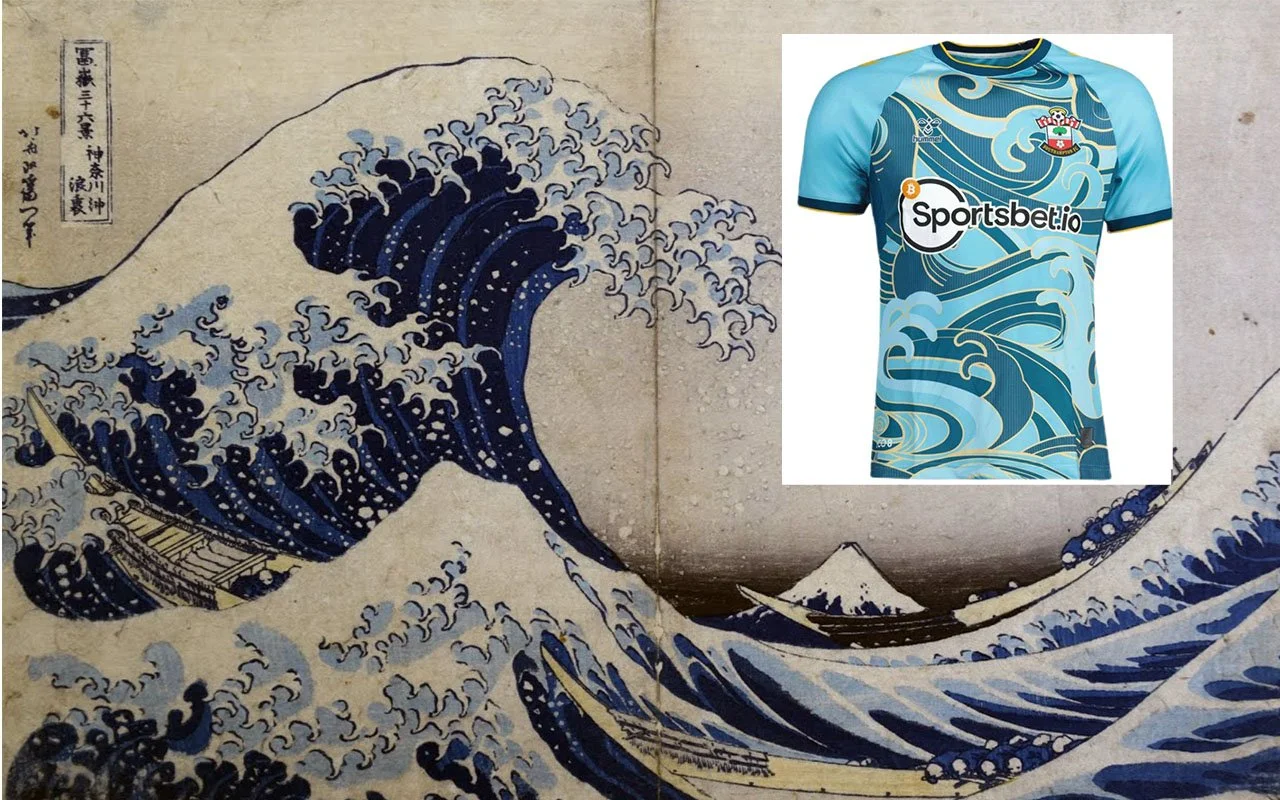
Hokusai’s “The Great Wave Off Kanagawa” and South Hampton’s away kit
Atmosphere 4
Built in 2001 St. Mary’s is a large stadium and one of the first modern venues in the Premier League. With that said its 22-year-old boxy design and lack of atmosphere have not aged well. This is exacerbated by the fact that it is widely agreed that the area of the grounds with the best atmosphere is the away end.
Total Points 13
West Ham United

Crest 5
There are so many things you could do with crossed hammers, or at least I think there are but you would not know it from West Ham’s straightforward design. It is distinctive and showcases the team’s quality color scheme but it also seems a little too simple. Maybe I’m just being influenced by the new season of Ted Lasso. I wonder how the producers of that show feel about West Ham's troubles after casting the Hammers as the towering favorites of the League for their show.
Kits 5
West Ham’s maroon home kits with sky-blue sleeves are iconic and pretty good. Unfortunately, their current away kits look like the designers were trying to start them on fire. Maybe it was the same design team that worked on Belgium’s World cup kits?
Atmosphere 3
West Ham moved from their old but raucous Boleyn Ground in 2016 to the cavernous and modern London Stadium. While London Stadium has state-of-the-art facilities it has never really managed to create an exciting atmosphere. This is due in part to the stands being so far away from the field that there is a lack of connection between the fans and players, that and the prices.
Total Points 13
Bournemouth

Crest 4
If Nottingham Forest captured all that was good about 1970’s design Bournemouth retains everything else from that period. First used in 1971 it contains the silhouette of Dicky Dowsett, the former cherry’s striker, moving upward to head a ball. I want to like this design. But I don’t.
Kits 3
I’m going to take a wild guess that the designers at Umbro assigned to come up with Bournemouths kits spent most of the pandemic remote working in Miami. The home kits are red with black lightning stripes, no doubt inspired by the temperamental weather on Florida’s southern tip, and the away kits are definitely made from old Miami Vice scenic backdrops.
Atmosphere 5
By all accounts, the small 12,000-seat Vitality Stadium is fine, just fine.
Total Points 12
Conclusion
As my scientific study has shown South Hampton, West Ham, and Bournemouth would end up being relegated if the final choice between the current bottom seven teams was decided by design and atmosphere. I’ll be curious how close this comes to the antiquated method of basing the decision on league play.

The relegation standings as determined by design and atmosphere of bottom seven clubs