
Who Did it Best? Duplicates in Peruvian Soccer Crests
Last week on the Footy Museum Pod we did a crest deep dive into Peruvian soccer crests, and touched on the bizarre similarities between various club badges. Sporting Cristal, Asociación Deportiva Tarma, and Defensor La Bocana are three clubs that have nearly identical badges (plus or minus a photoshopped shark or two). Check out the episode to hear more about these three clubs, and who we think “did it best”.
These three clubs aren’t the only ones with similar designs! Below are three more clubs that look like they copied each others homework.

Alianza Lima vs Alianza Atlético


Maybe they’re not an exact copy of one another, but theses two clubs definitely started with the same template in Canva. Alianza Lima, one of the powerhouses of Peruvian Football, started using various versions of this crest in the 1950s. Earlier versions were derived from the coat of arms of Lima, elements of which can still be seen in the crest today. The blue and white stripes correspond with the club’s blue and white jerseys that they’ve used since 1911.
Alianza Atletico Sullana's escudo contains an illustrated depiction of the town’s local landmarks. What’s meant to be a cathedral, trees, and river might look more like a mosque, smoke stacks, and a chain link fence, but the costumbrist drawing is decidedly more nifty and unique compared to Alianza Lima’s escudo design.
So who did it better? We have to give it to Alianza Atlético for it’s handmade feel.

Original Alianza Lima Badge, used until the 1950s.

Lima Coat of Arms

Iglesia Matriz de Sullana and surrounding trees. Inspiration for the badge used by Alianza Atlético Sullana.
Universitario de Deportes vs Deportivo Garcilaso

When you go basic, it’s hard to make a case that someone is a copycat—but red letter inside red circle…..couldn’t someone pick a different color? If you couldn’t tell, the badge with the “U” belongs to Universitario de Deportes, another giant of Peruvian football, and main rival of Alianaza Lima. This group was founded in 1924 by a group from the Universidad Nacional Mayor de San Marcos. Luis Malaga Arenas was the designer of the original shield. One of the distinctions between this badge and the one belonging to Deportivo Garcilaso is the cream background. The story goes that the team changed from white kits to cream after a laundry incident where the maroon badges weren’t removed from the kits before throwing them in the wash. The whole batch of clothes was dyed cream.
Less is known about Deportivo Garcilaso, as they are new to Liga 1 after winning the 2022 Copa Peru. Although they’re new, Garcilaso has managed to climb to the top of the table as Liga 1 begins their 2023 season.
So who did it best? With its superior color palate and better use of line varied line weight, Universitario wins here. The Garcilaso crest looks a bit like if the Green Bay Packers and Target had a baby.

Historic photo of Garcilaso
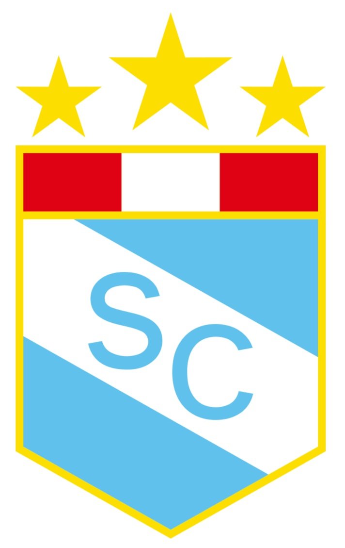
Sporting Cristal vs Asociación Deportiva Tarma (vs Defensor la Bocana)


Sporting Cristal and Asociación Deportiva Tarma have by far the most similar shield designs out of the bunch, but we couldn’t help but bring Defensor La Bocana into the conversation as well. Consider this our petition for more shark-based football designs. Listen to the conversation we had about these badges on the Peru episode of the Footy Museum Podcast.